Challenge
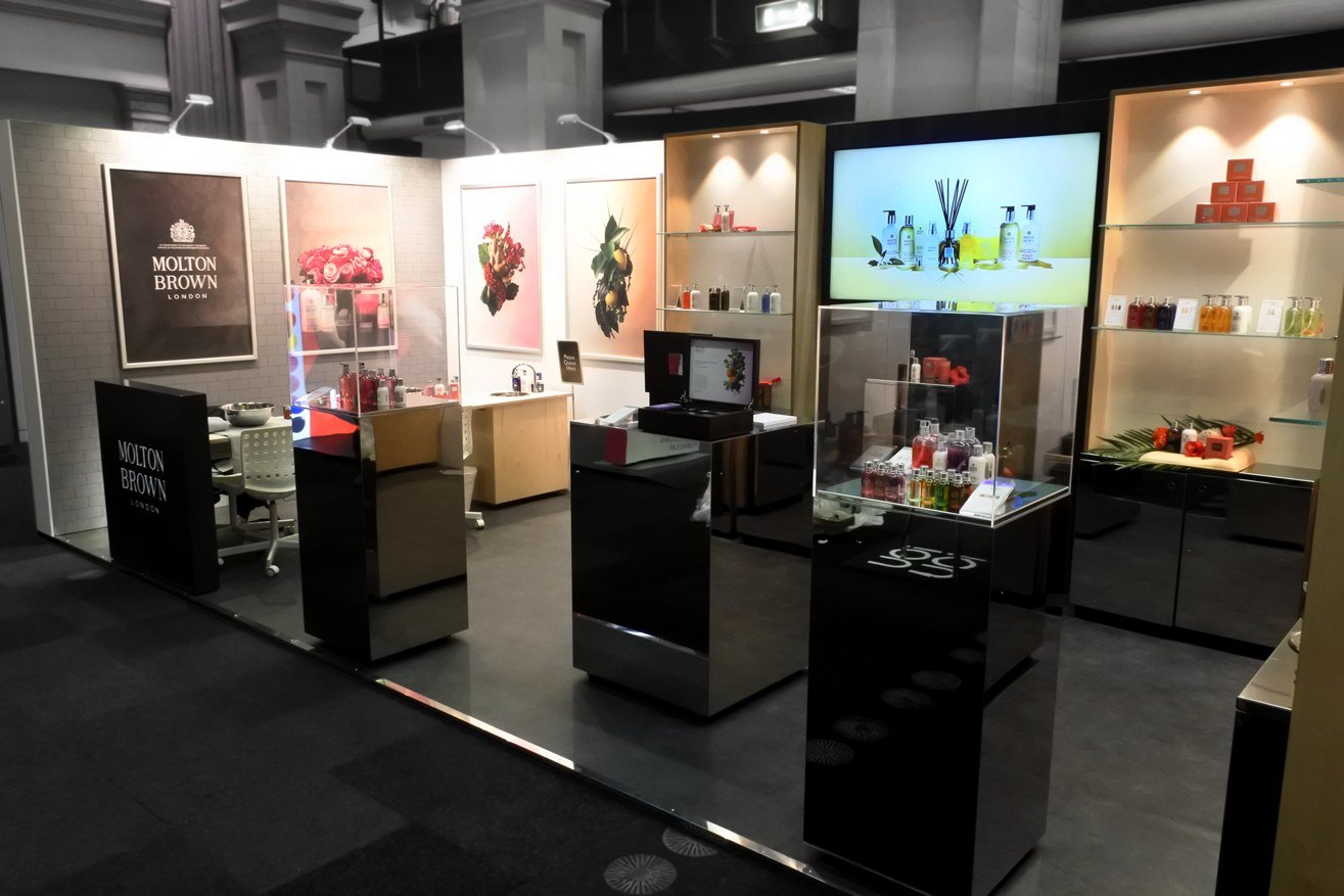
Molton Brown’s stores do the selling: the finishes, the lighting and the chance to try a product on your own hands. At QVC Beauty, a premium beauty show, the brand needed a stand that felt just as distinctive, so visitors would recognise it from the aisle and stay long enough to try the range.
Beauty is bought by touch. It had to feel like walking into a Molton Brown store, not past a stand.
Creative response
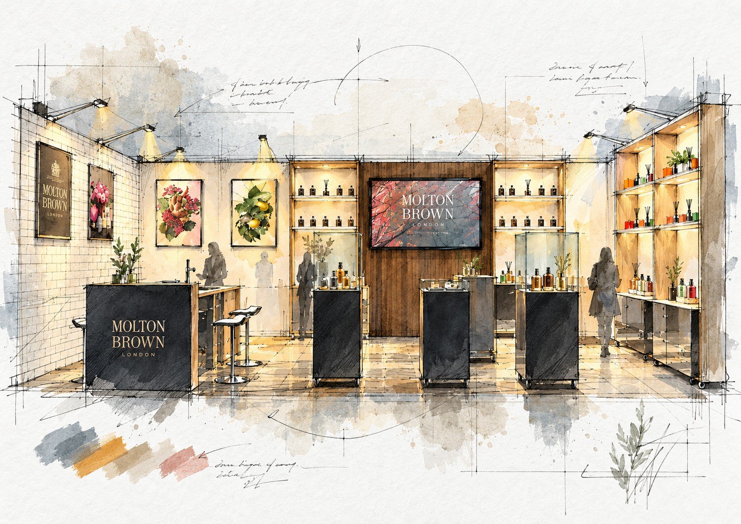
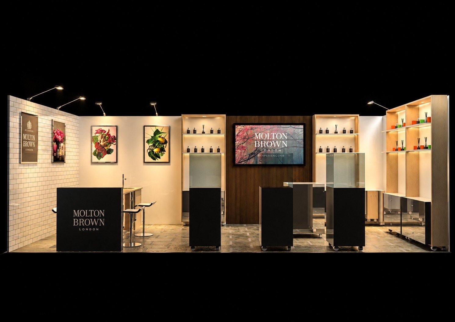
I rebuilt the store for the show floor: the same materials, the same lit shelving and the same ritual of trying before buying.
Experience
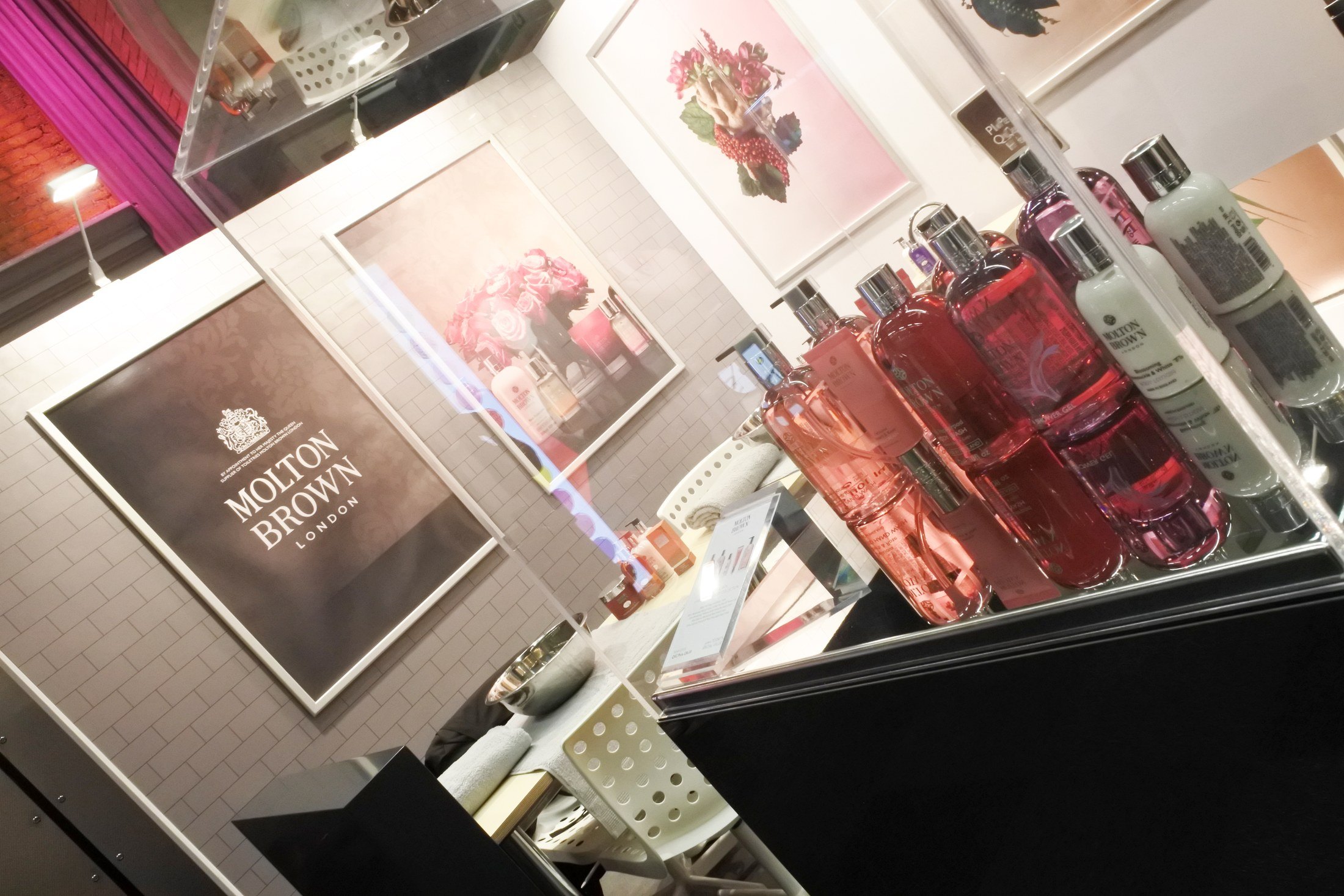
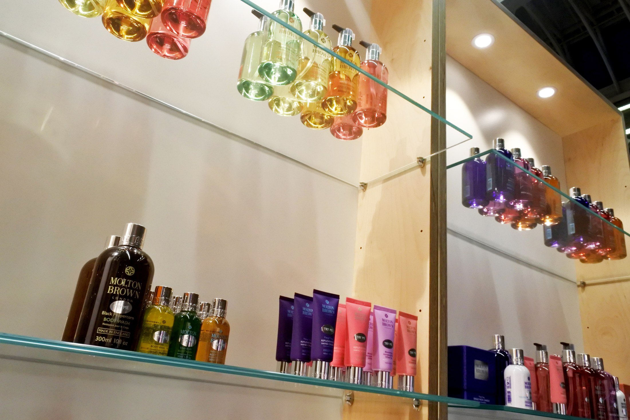
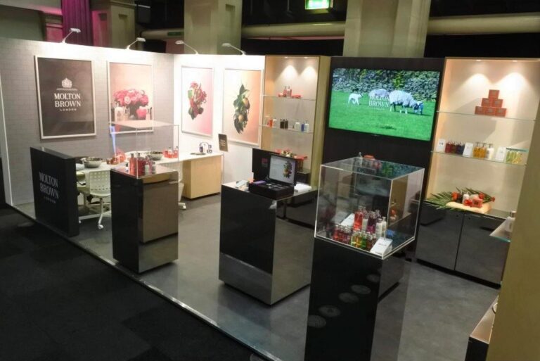
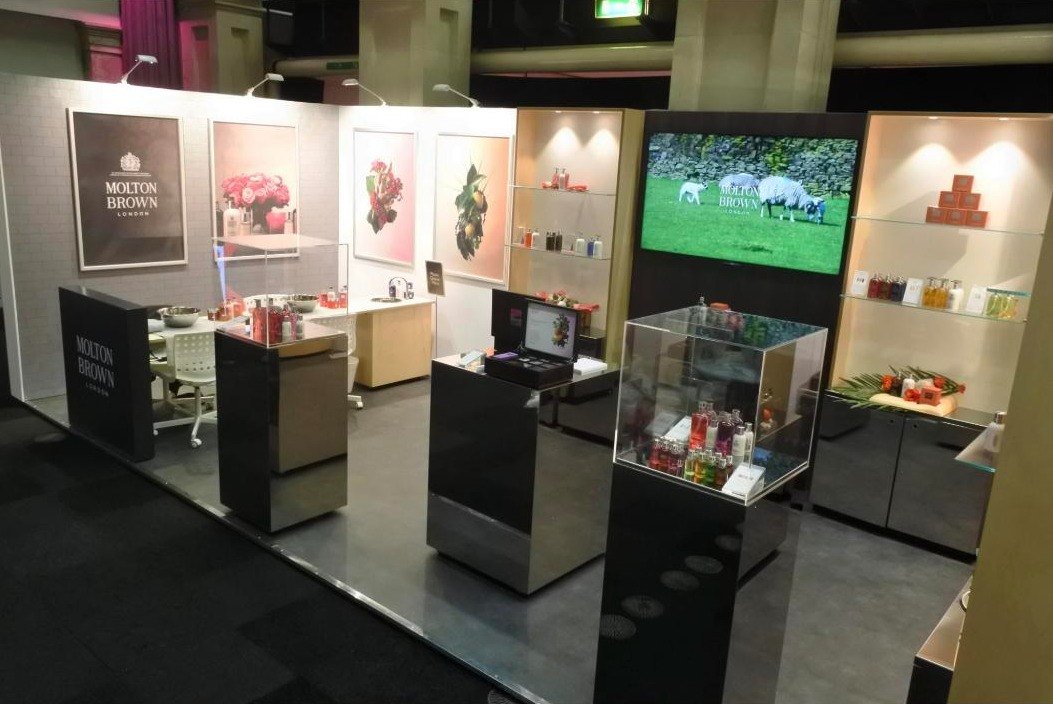
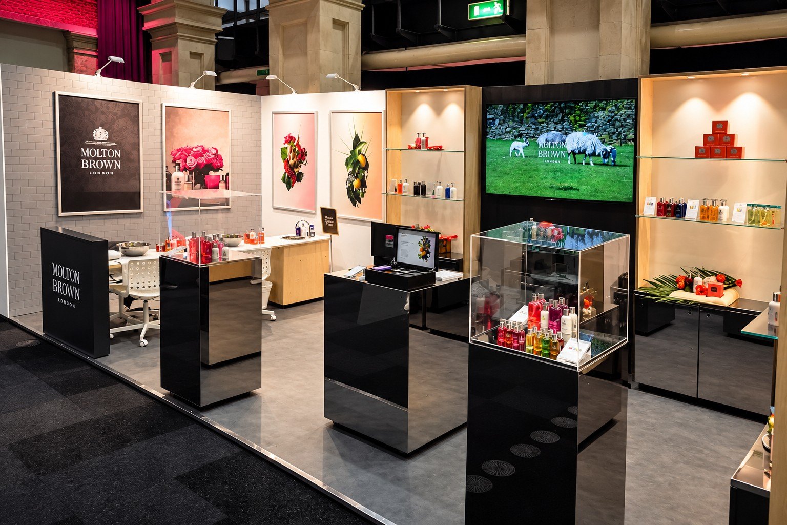
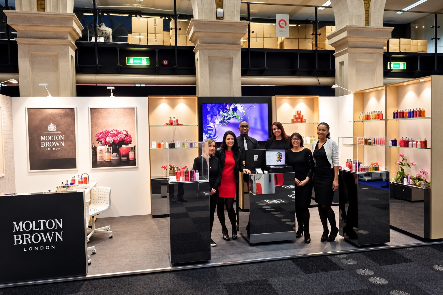
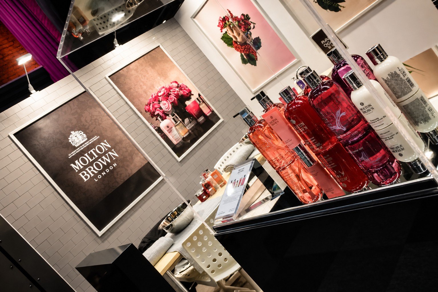
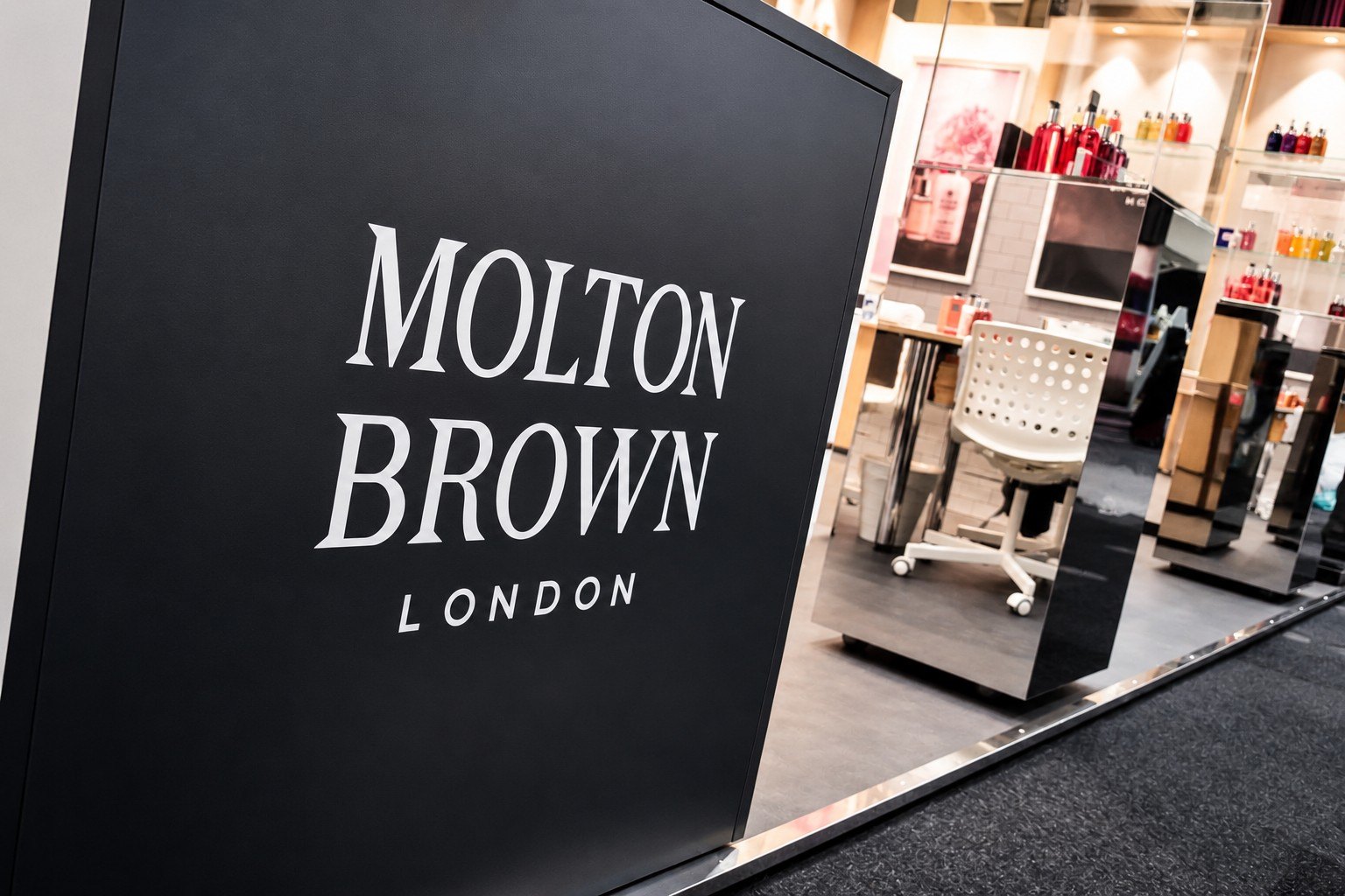
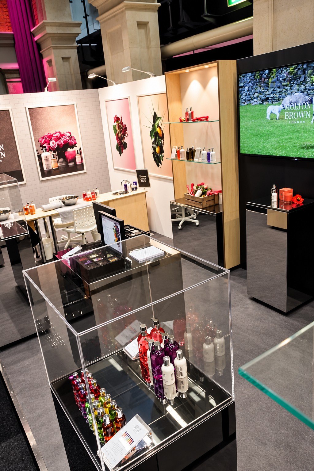
Visitors recognised the stand from the aisle: lit timber shelving, framed botanical artwork and Molton Brown’s black logo panels. Inside, mirrored black plinths and acrylic display cases put the products at hand height, and a hand-treatment bar invited people to try them for themselves. A large screen carried brand film, and a meeting area along the back wall gave the team space to talk.
Results
On-brand
Store look and feel, recognisable from the aisle
Hands-on
Hand-treatment bar for live product sampling
Store-grade
Mirrored plinths, lit shelving and acrylic display cases
A Molton Brown store, rebuilt for the show floor: the same finishes, the same rituals, and space for visitors to try the products for themselves.
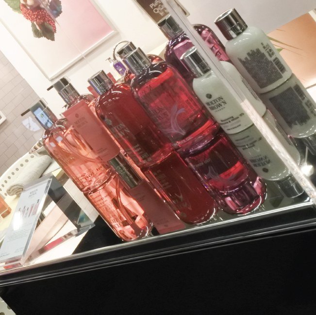
The stand, close up
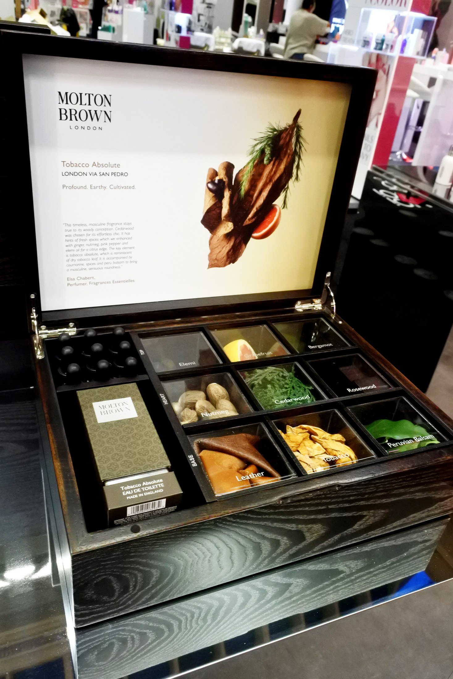
Photography of the same stand shot at the QVC Beauty, where it appears in the archive under its second name.
Experience
Everything was dark so the product could be the only bright thing. Lit timber shelving and mirrored black plinths held the bottles at hand height, and along one wall the glass shelves ran the full range graded by colour, from amber through pink to deep green, which turns a product list into a gradient you read in one look. Framed botanical artwork and the Molton Brown London mark sat on black panels between the displays. The detail that gives the idea away is the ingredient box: a shallow case opened flat with compartments of the actual raw materials beside a screen naming the scent, so the thing being sold was the composition rather than the bottle.