Creative response
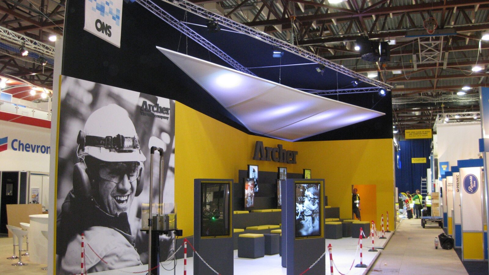
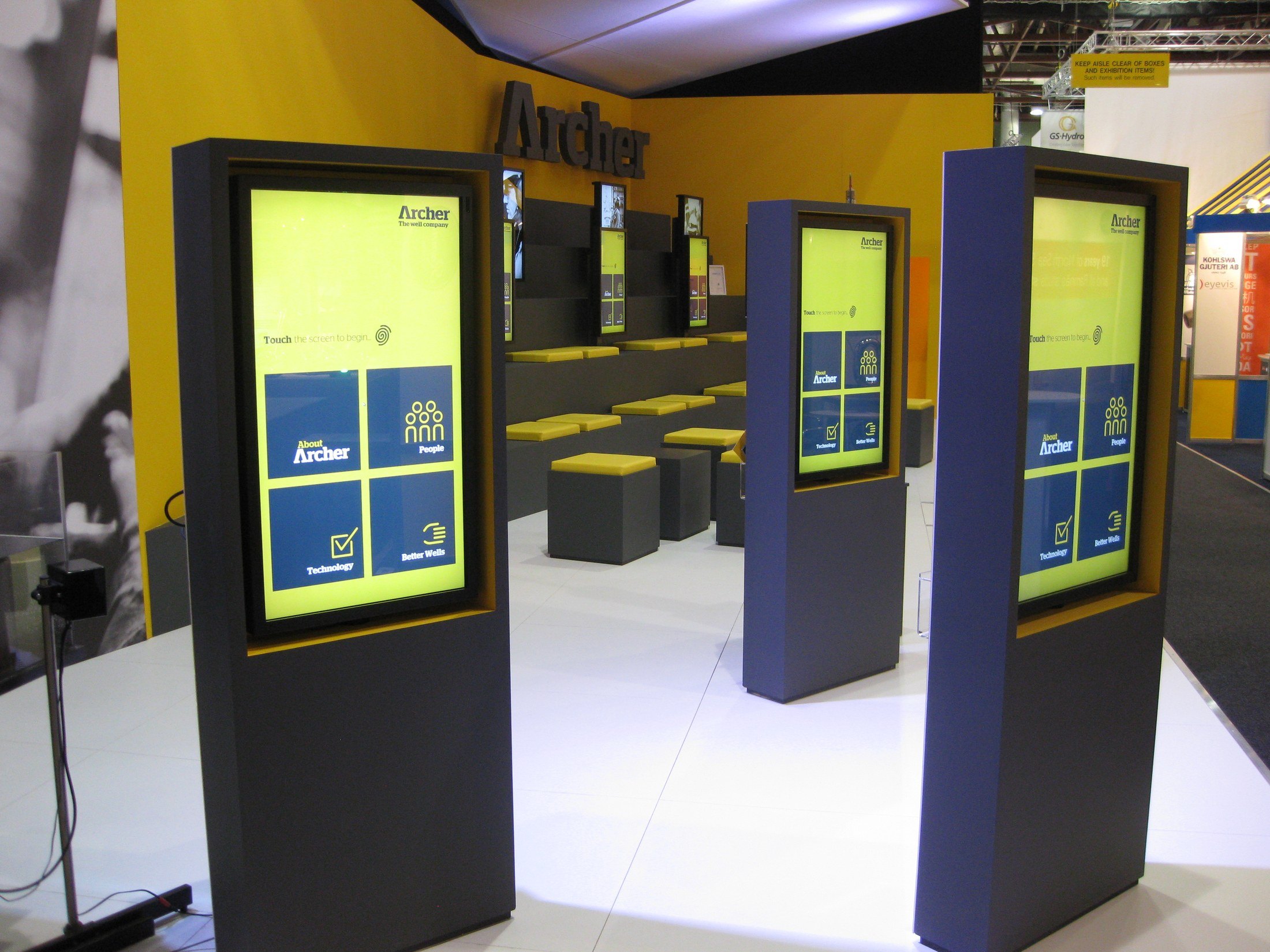
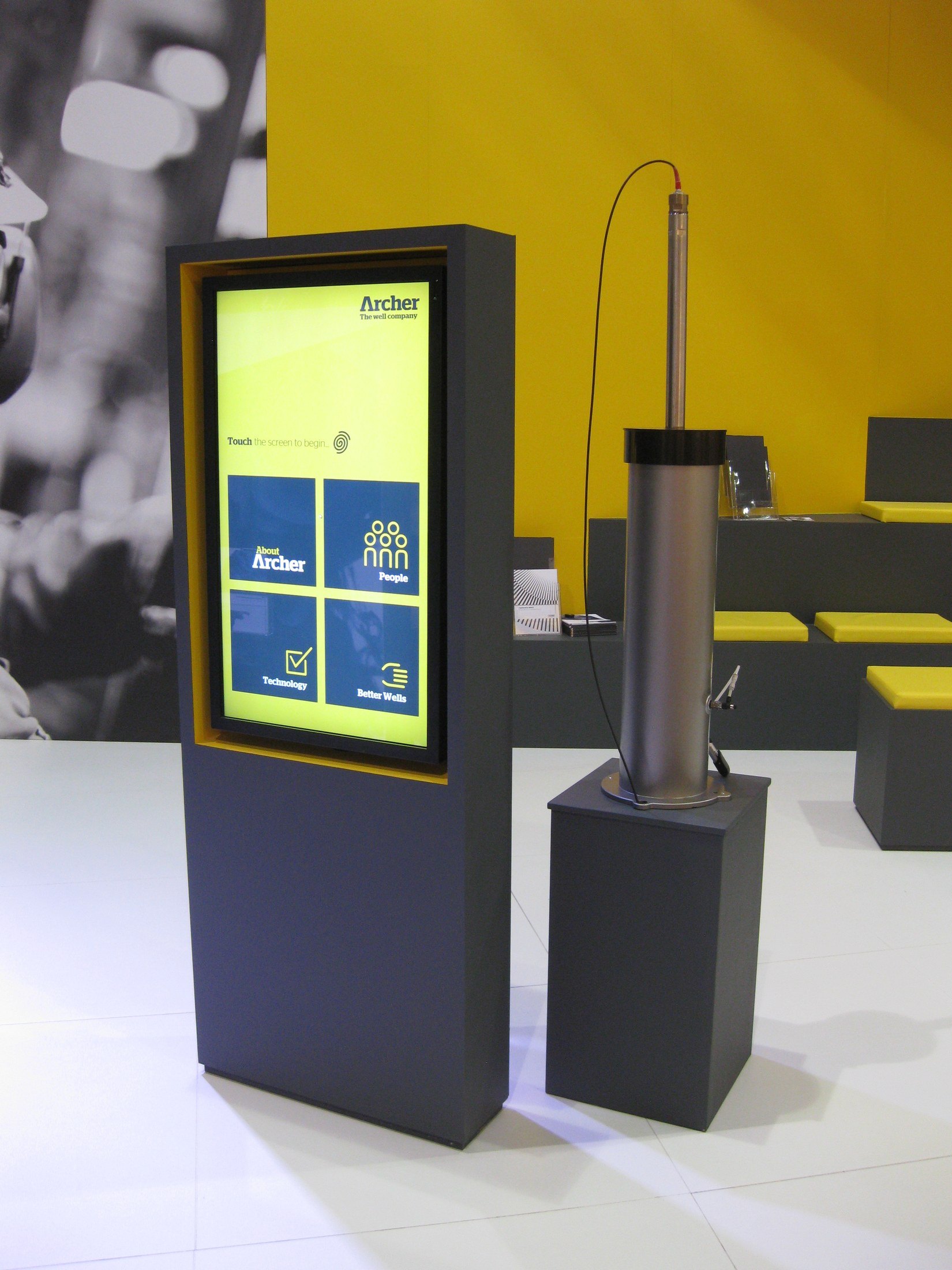
Archer’s yellow is the loudest thing in an oil and gas hall, so the stand uses it as the only colour and puts everything else in charcoal and white. The interface follows the same discipline: a home screen of four deep blue tiles in a 2×2 grid, one icon each, no more. Four things to choose from, chosen from across the aisle, and the frame of each totem is edged in the same yellow so screen and structure read as one object rather than a monitor bolted to a stand.
Experience
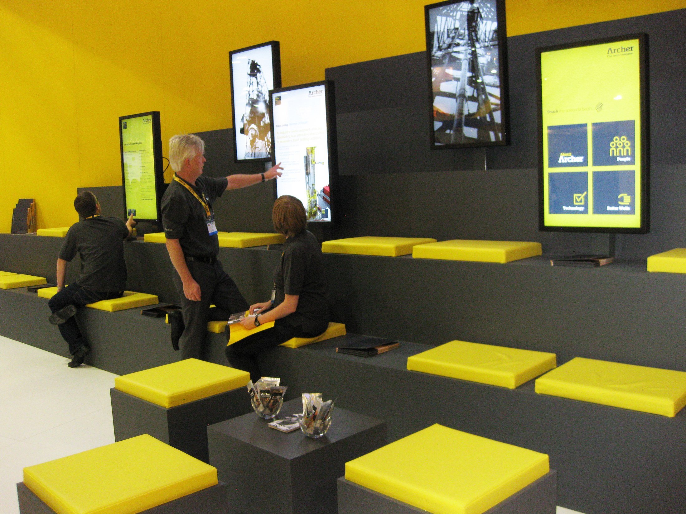
The totems stand free in the walkway in a loose row, so several people can use them at once without forming a queue, and the tall portrait format means a person reads them at eye level without stooping. One of them is paired with an actual downhole tool on a plinth beside it — the screen explains the thing, the thing is right there. The back wall is the opposite move: a bank of portrait screens above tiered charcoal seating with yellow cushion pads, an amphitheatre rather than a meeting room, so a conversation can be had sitting down in the open with a presentation running behind it. Over all of it, a black-and-white photograph of a man in a hard hat, laughing, at about three metres tall.

Written from the stand photography in the archive. Please confirm the show, the year and your role.