Experience
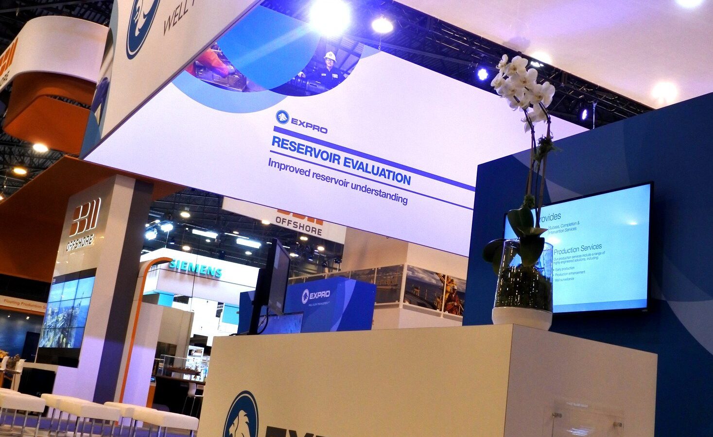
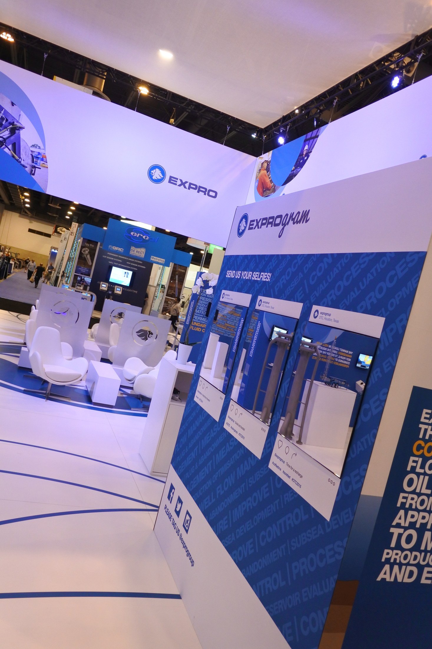
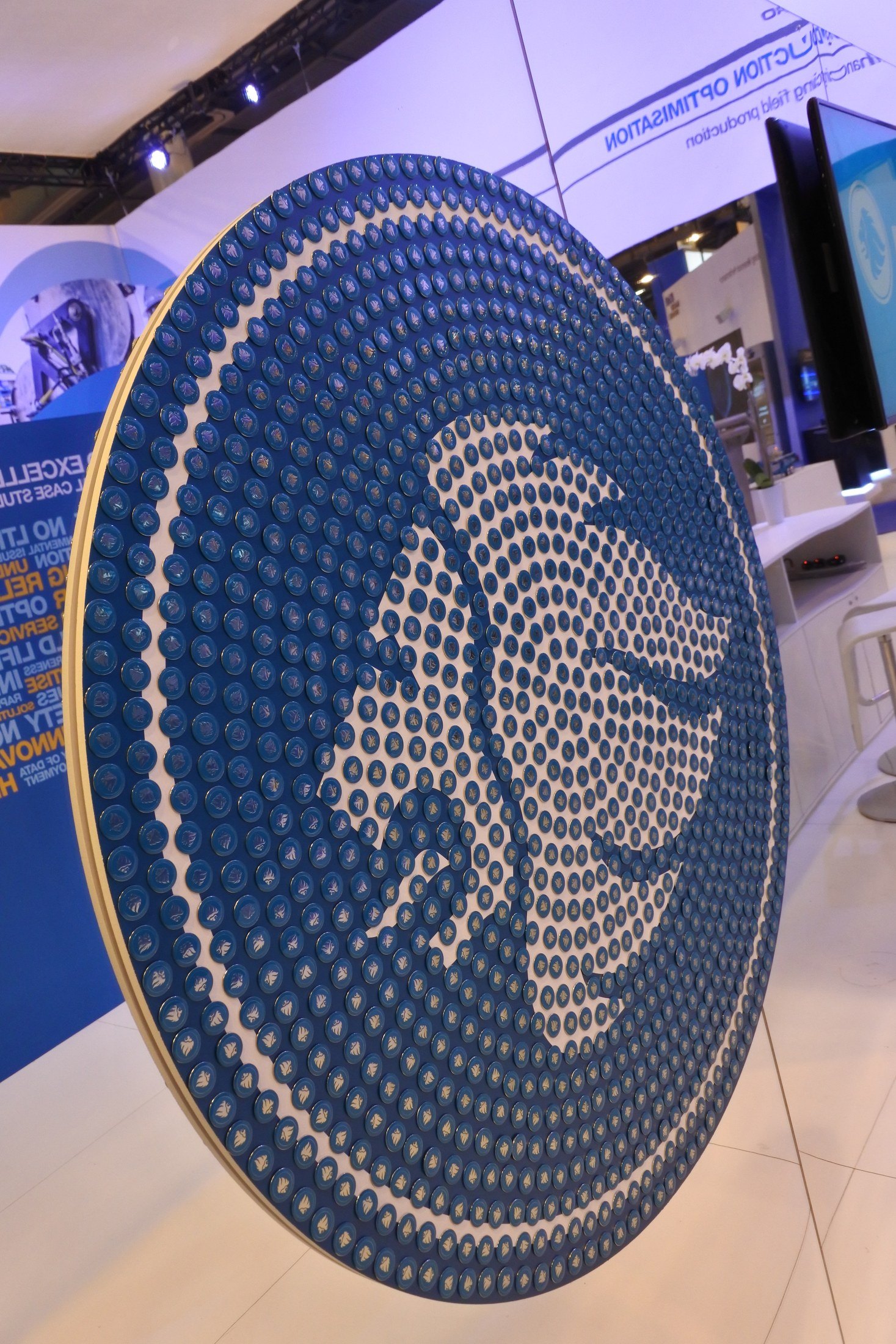
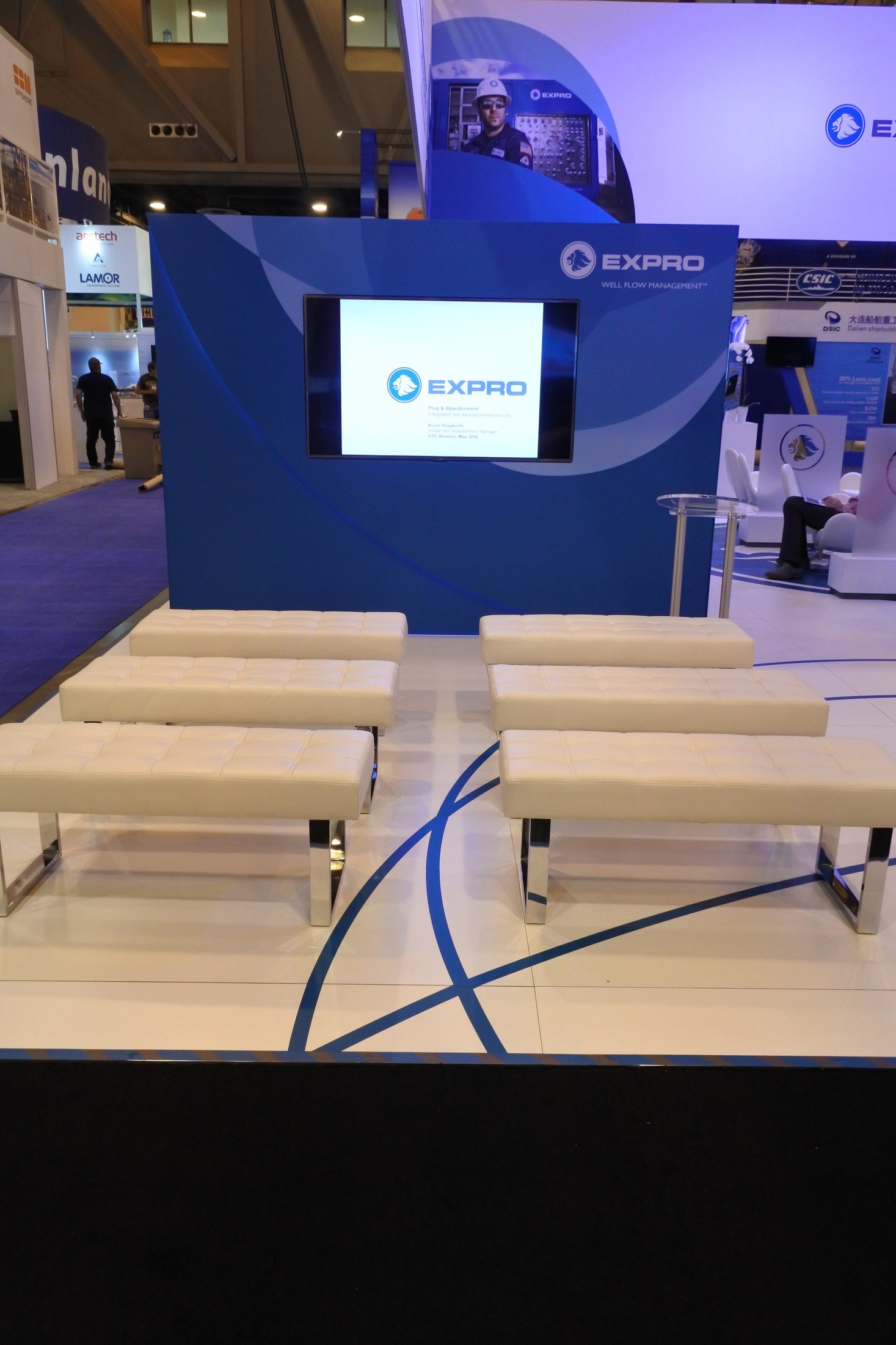
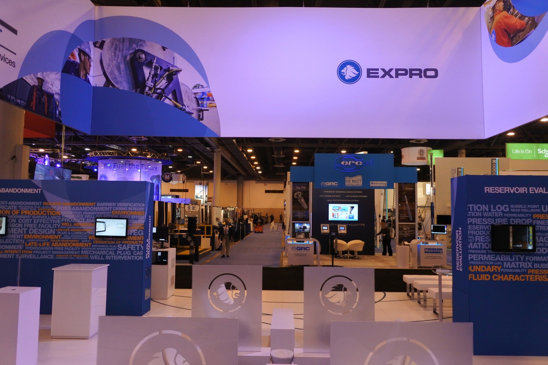
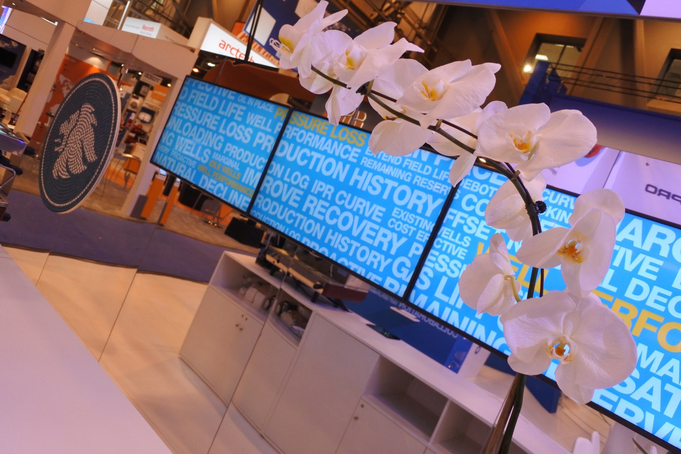
A white fascia ran the length of the stand carrying the Expro mark and “Well Flow Management”, and everything below it was deep blue. The walls were set densely with the vocabulary of the job — permeability, pressure drop, production history, fluid characteristics — in white type at varying weights, so from the aisle they read as texture and up close as a list of what the company actually measures. Against that, a circular panel with a gold rim carried a dot-matrix emblem built from the same halftone language. The furniture went the other way entirely: a white reception counter at the corner, white benches and low stools, and orchids on the counters.
Written from the project photography in the archive. Cyrillic signage appears on a neighbouring stand — please confirm the event, the year and your role.