This is a design concept proposal rather than a record of a delivered stand. The brief and the response below are quoted from the proposal document; whether the work was awarded and built is not recorded in the archive.
Challenge
Welltec asked for a design that was flexible and worked consistently across all of the stands it would exhibit through 2020, with innovative approaches to product display and messaging illustrated where possible. Six things were named specifically: the circle design element had to be incorporated; the navigation of the stand was key; each tool needed considered display; furniture and finishes had to be styled to a high-end standard; concepts for engagement were to be included; and the design had to work across the board.
A design that works across the board.
Creative response
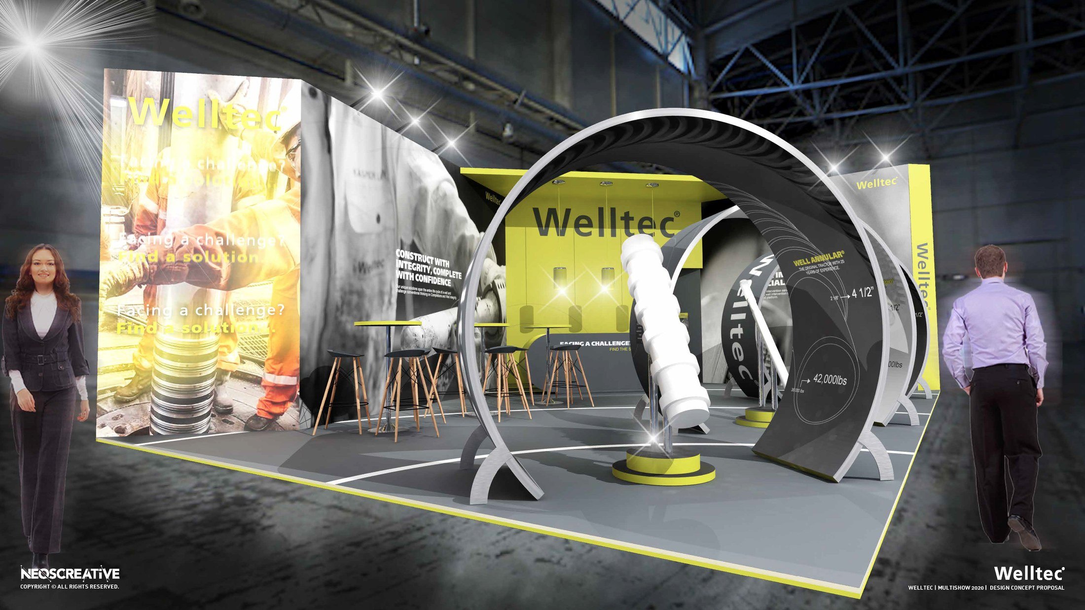
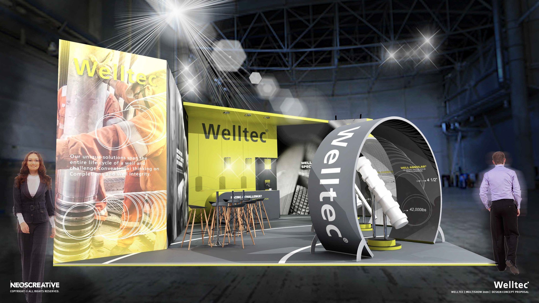
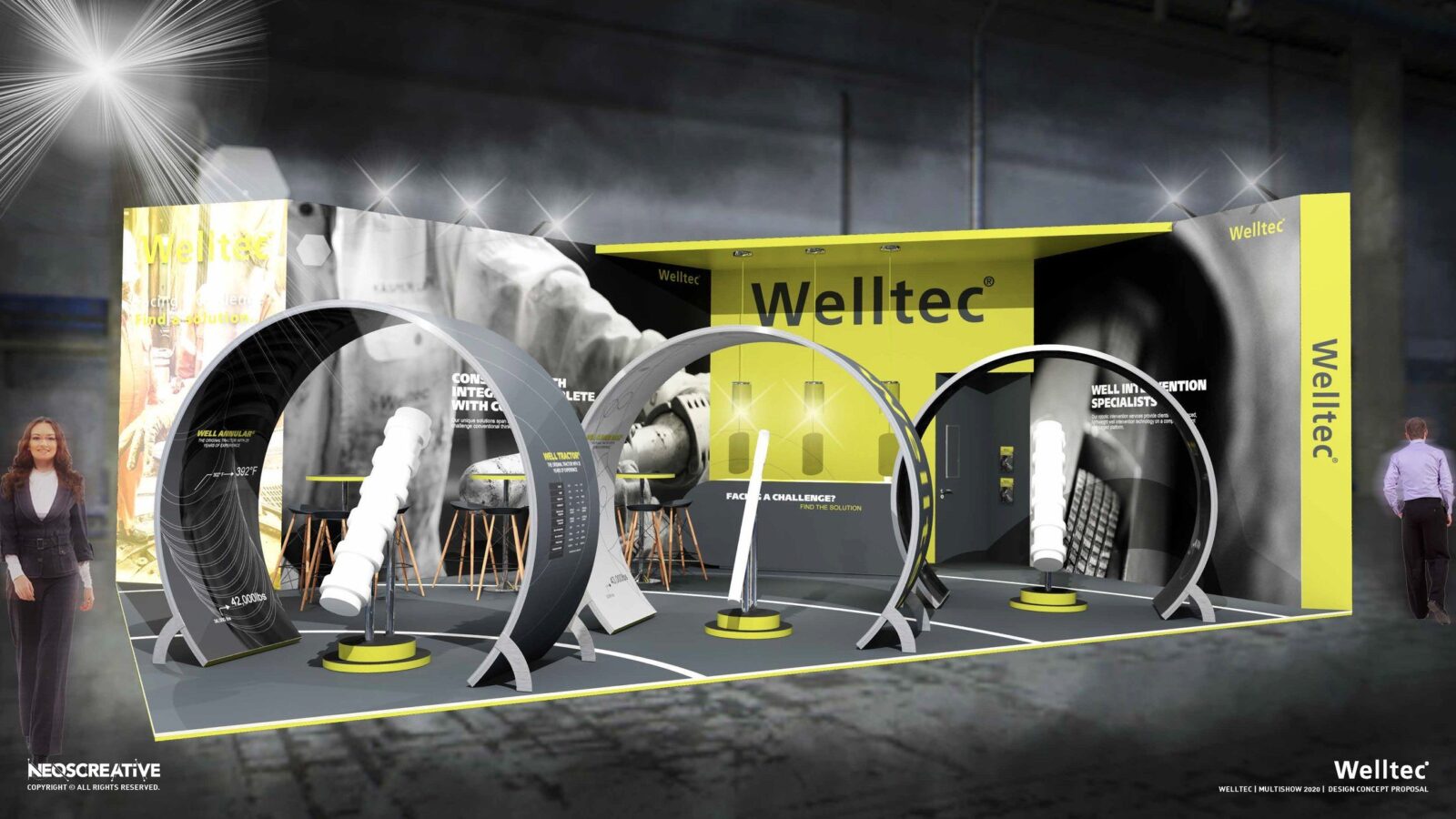
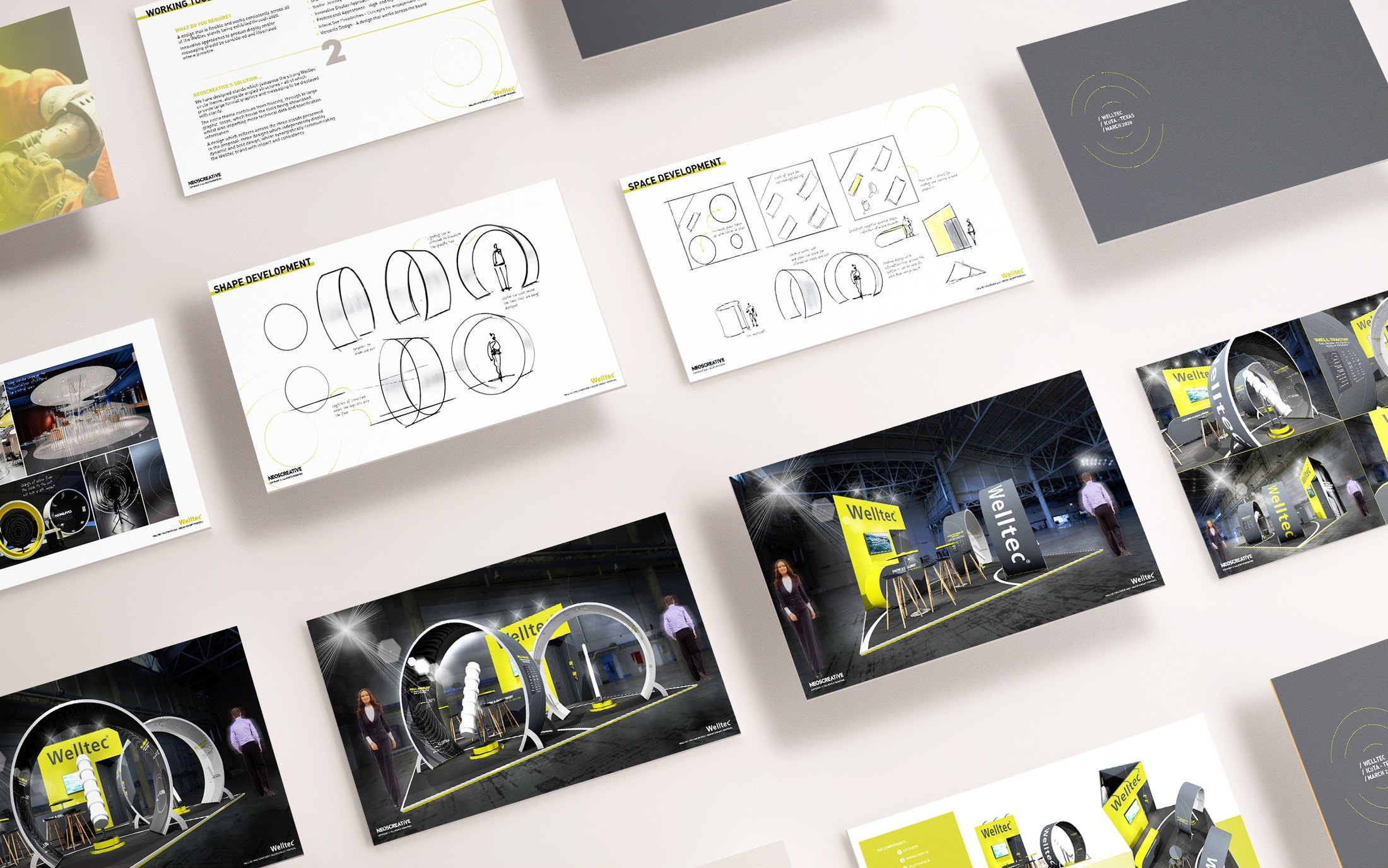
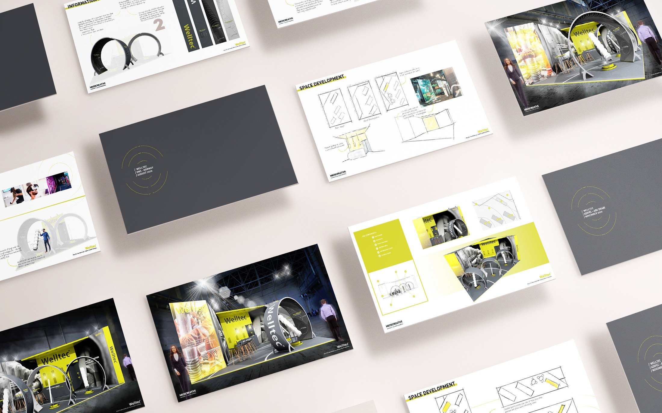
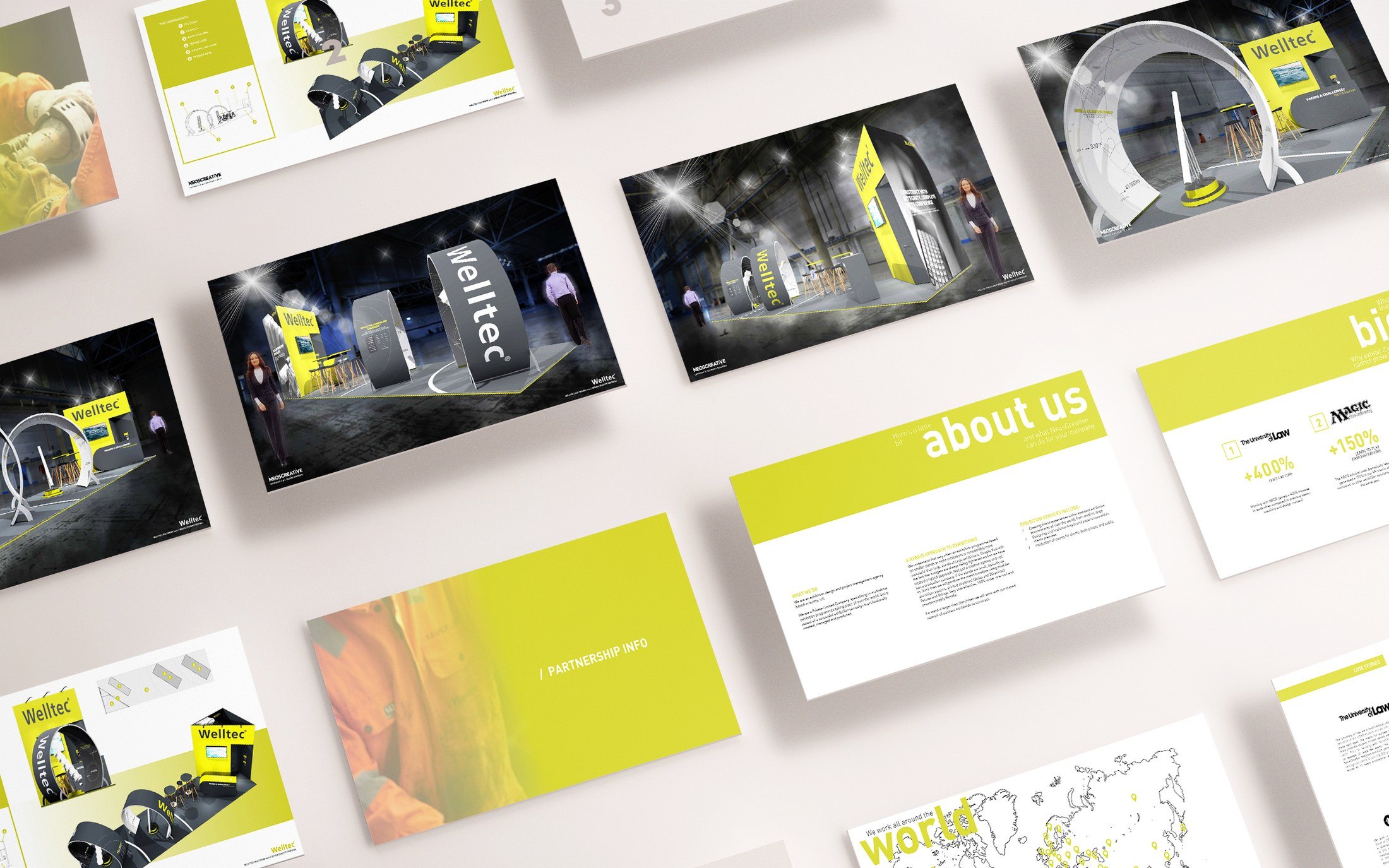
Stands that juxtapose the strong Welltec circle theme against angled structures, both of which give large-format graphics and messaging room to be read clearly. The circle theme runs from the flooring up into large graphic loops, which house the tools being showcased while also carrying technical data and specification information. Three stands were presented, each independently bold, and all three communicating the Welltec brand consistently.
Experience
In the visuals, a tall circular loop frames the way in, with a tool mounted inside it on a lit yellow plinth so the product sits at the centre of the opening rather than along a back wall. A yellow fascia carries the Welltec name above, angled walls take the large-format graphics, and the seating and meeting space sits behind the loops where the circulation has already slowed.